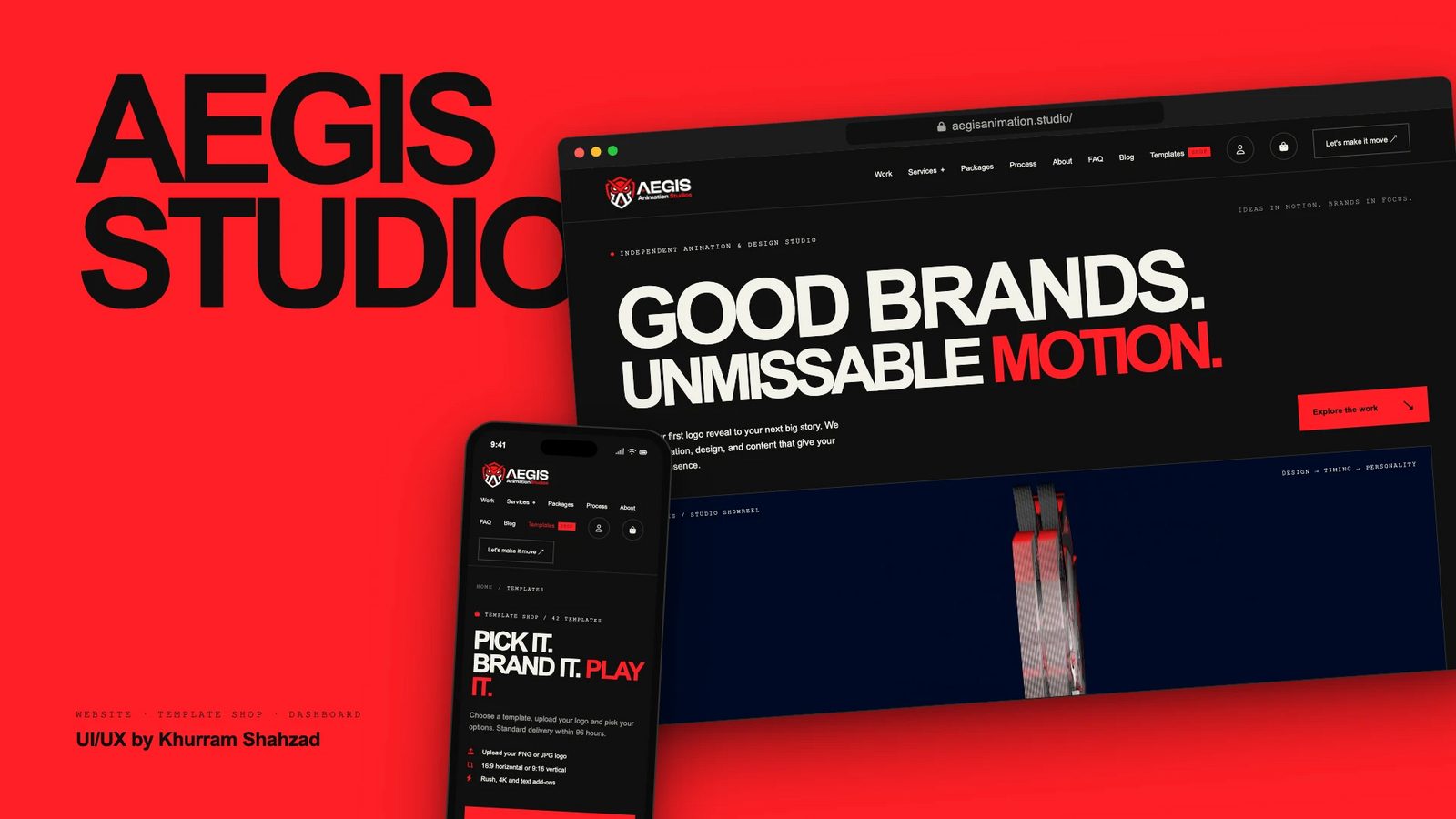
Designed the website, template shop and ordering flow for an independent animation studio: ten services in one mega menu, 42 ready-made templates and a five-step order flow that works on a phone.
I was the UI/UX designer for Aegis Animation Studios, from the first homepage layout to the design system, the service pages and the template shop.
The client
Aegis is an independent animation and design studio. Its line is "Ideas in motion. Brands in focus.", and it makes animation, design and content for brands, from a first logo reveal to the next big story.
The design challenge
A motion studio sells something a page cannot show without moving. The site had to let the work lead, explain ten services without a wall of text, and let a visitor buy a ready-made template without it feeling like filling in a form.
Four goals
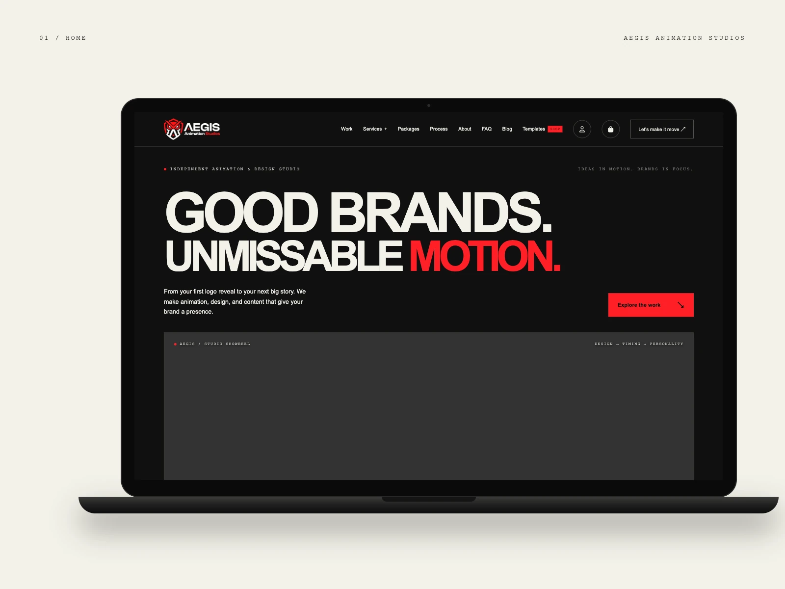
- Let the work lead. A bold headline, "Good brands. Unmissable motion.", sits above a studio showreel panel, so the first screen is about the output.
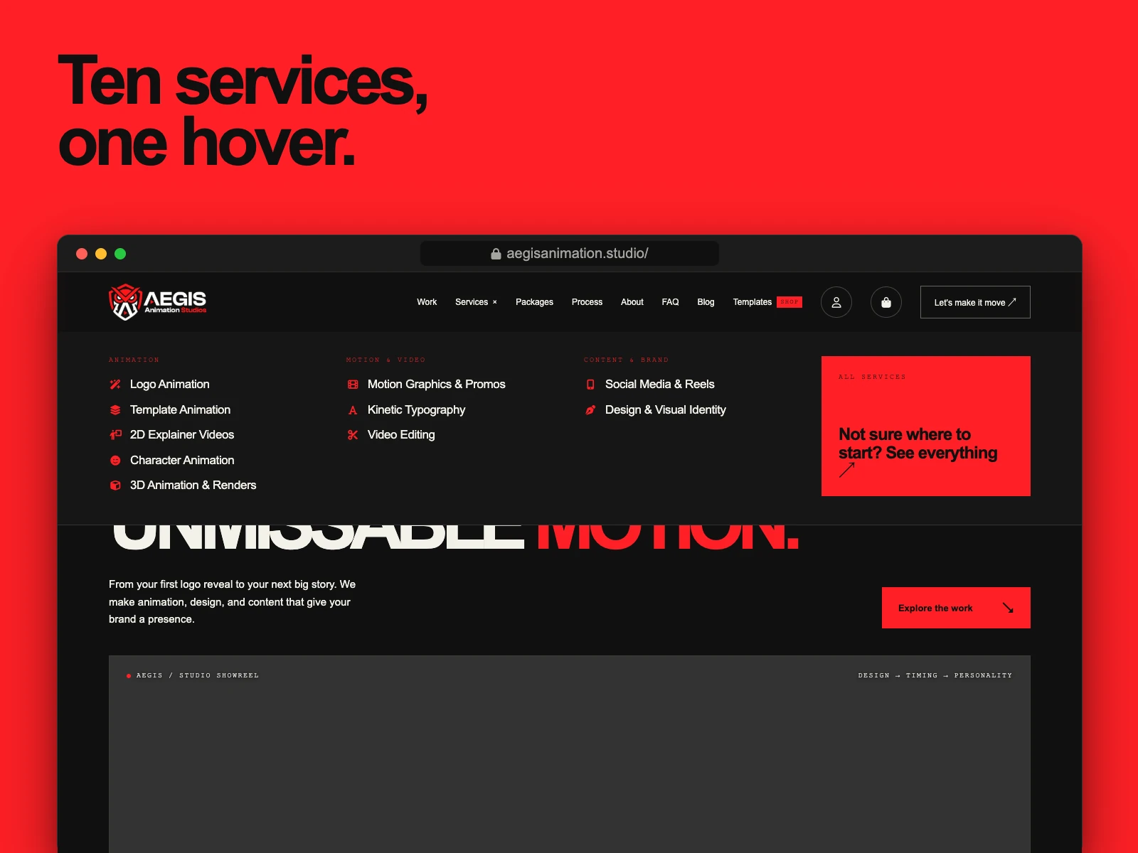
- Make ten services easy to scan. One mega menu groups them into Animation, Motion and video, and Content and brand.
- Turn browsing into orders. A template shop with 42 templates and a short order flow for ready-made work, plus quoted packages for custom projects.
- Work on a phone. Every template and every form was designed for thumbs first.
What I designed
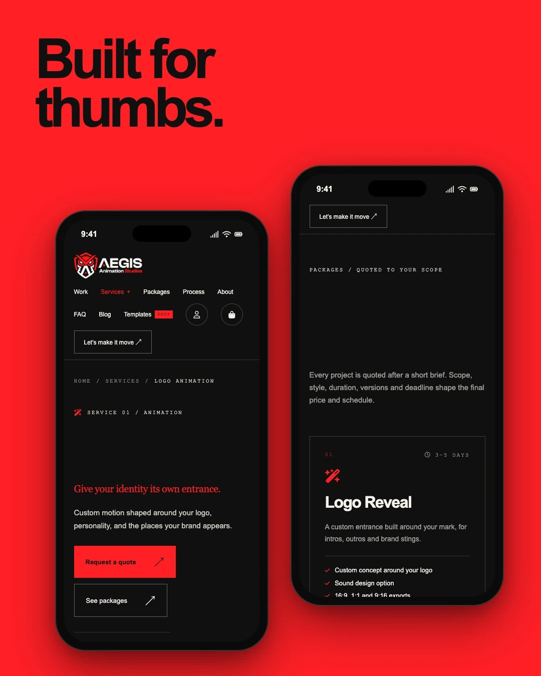
The main navigation has Work, Services, Packages, Process, About, FAQ, Blog and Templates, with account and basket icons and one clear action, "Let's make it move". The Templates link carries a small red SHOP badge so the store is never hidden.
Under Services, the mega menu lists all ten: logo animation, template animation, 2D explainer videos, character animation, and 3D animation and renders, then motion graphics and promos, kinetic typography and video editing, then social media and reels, and design and visual identity. A red tile at the end, "Not sure where to start? See everything", catches visitors who do not know which service they need.
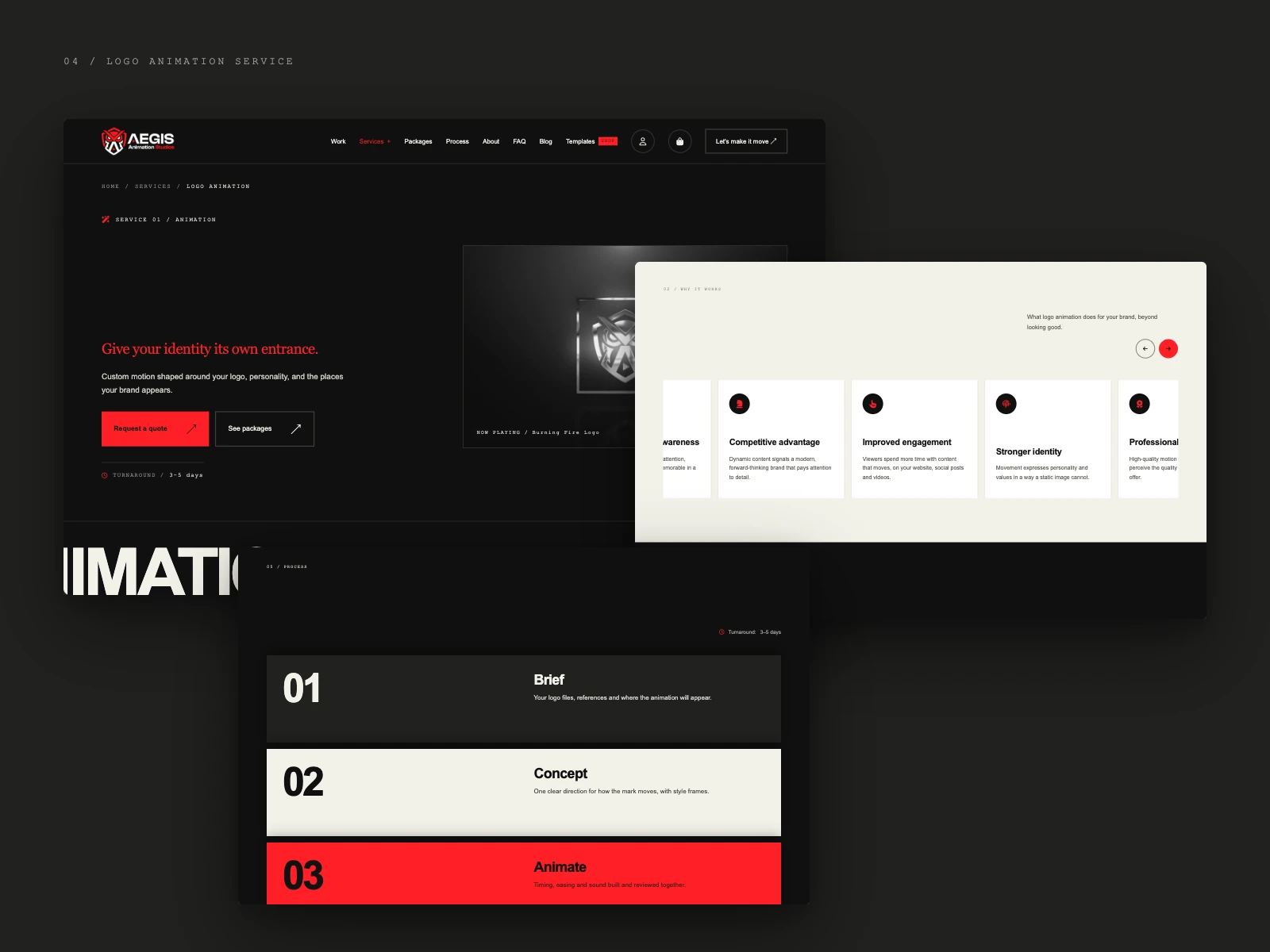
Each service page shares one template: a breadcrumb trail, a service number, a serif headline in red such as "Give your identity its own entrance.", a primary "Request a quote" button beside a quieter "See packages" one, and the typical turnaround, for example 3 to 5 days. A preview panel plays the work, a "Why it works" carousel explains the benefits, such as competitive advantage, improved engagement and stronger identity, and a numbered process runs from brief to concept to animation in alternating ink, cream and red bands.
Packages are quoted to the scope. Every project starts with a short brief, and scope, style, duration, versions and deadline shape the final price and schedule. Each package card shows its turnaround and what is included, for example a custom concept around the logo, a sound design option and 16:9, 1:1 and 9:16 exports.
The template shop
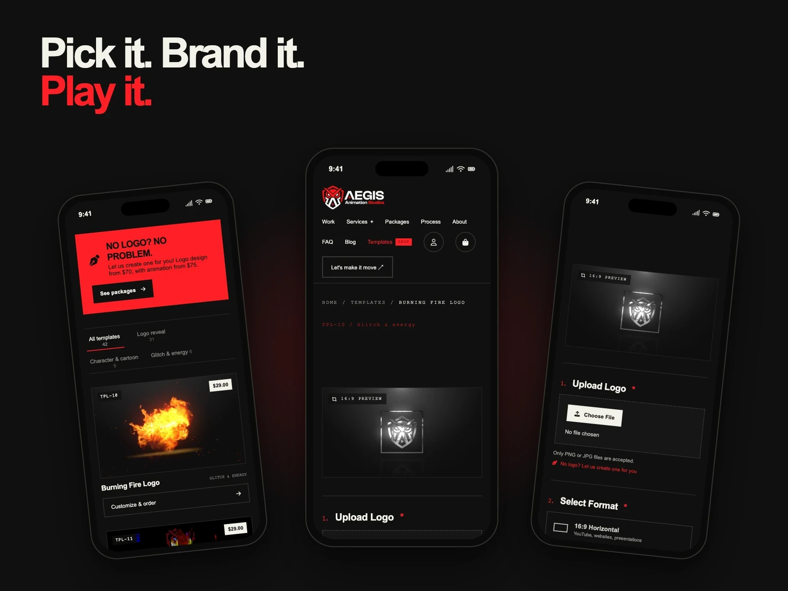
The shop reads "Pick it. Brand it. Play it." It holds 42 templates, filtered into Logo reveal, Character and cartoon, and Glitch and energy, each card showing a preview, a template code and a "Customize and order" button. A red banner, "No logo? No problem.", sends visitors without a logo to the packages page.
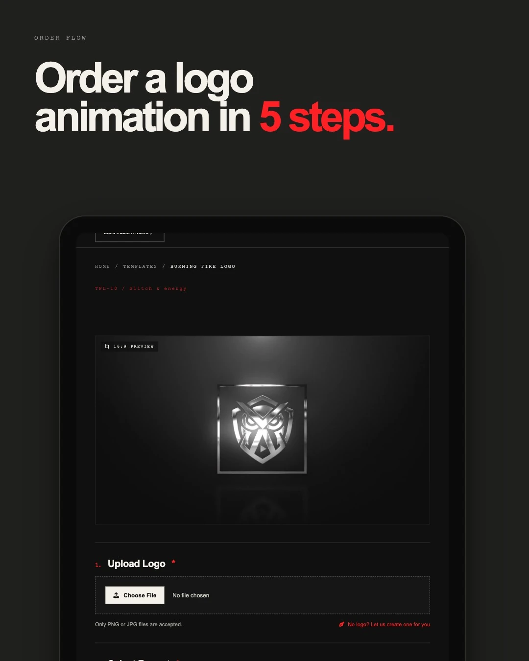
The order flow takes five steps. A template page opens with a 16:9 preview, then asks for the logo (PNG or JPG only, with a "No logo? Let us create one for you" shortcut), the format, 16:9 horizontal or 9:16 vertical, and optional add-ons such as rush delivery, 4K and text. Standard delivery is within 96 hours.
The design system
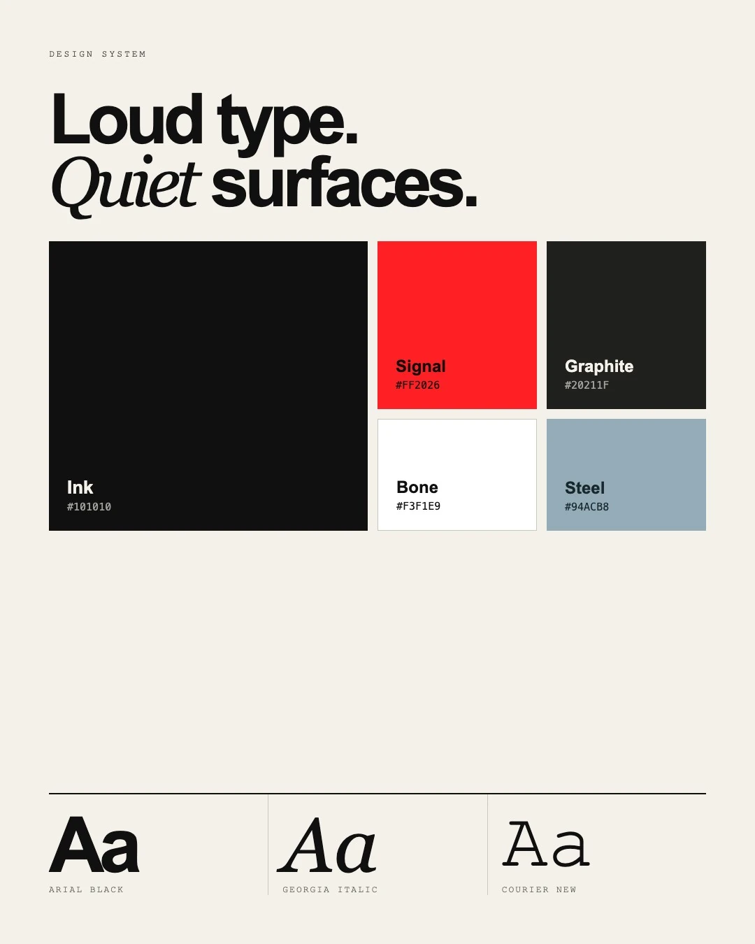
The idea is loud type on quiet surfaces. Headlines are heavy and tightly set, a serif italic adds a human accent, and monospaced labels give the site a technical, studio feel. Surfaces stay dark or bone, so one signal red can carry every action, the active menu item and the step numbers.
| Token | Value |
|---|---|
| Ink | #101010 |
| Signal | #FF2026, used for actions and accents |
| Graphite | #20211F |
| Bone | #F3F1E9 |
| Steel | #94ACB8 |
| Display type | Arial Black |
| Accent type | Georgia Italic |
| Label type | Courier New |
Built for thumbs
On a phone the navigation wraps into two rows of large tap targets, with the account and basket icons beside the main action. The quote and packages buttons stack at full width, and package cards stack one above the other with the turnaround at the top. In the shop, the category tabs, template cards and order form follow the same single column.
The result
A complete UI/UX design for a studio website, a template shop and a dashboard, with a design system that carries the same loud, calm look from the homepage to the last step of an order.
Planning a redesign of your own? See my UI/UX design services or ask for a quote.